Field Guide
How the CMIYGL world is built, one passport detail at a time
Before you hear a song, the album has already handed you a document. That is what makes the CMIYGL look feel so complete: the card, the stamp, the stars, the paper grain, and the quiet bureaucracy of issue fields all make the world believable before the first verse lands.
Field Guide
Call Me If You Get Lost Field Guide
The card is a doorway
It feels less like merch art and more like a pass into a world with rules, stamps, and aliases.
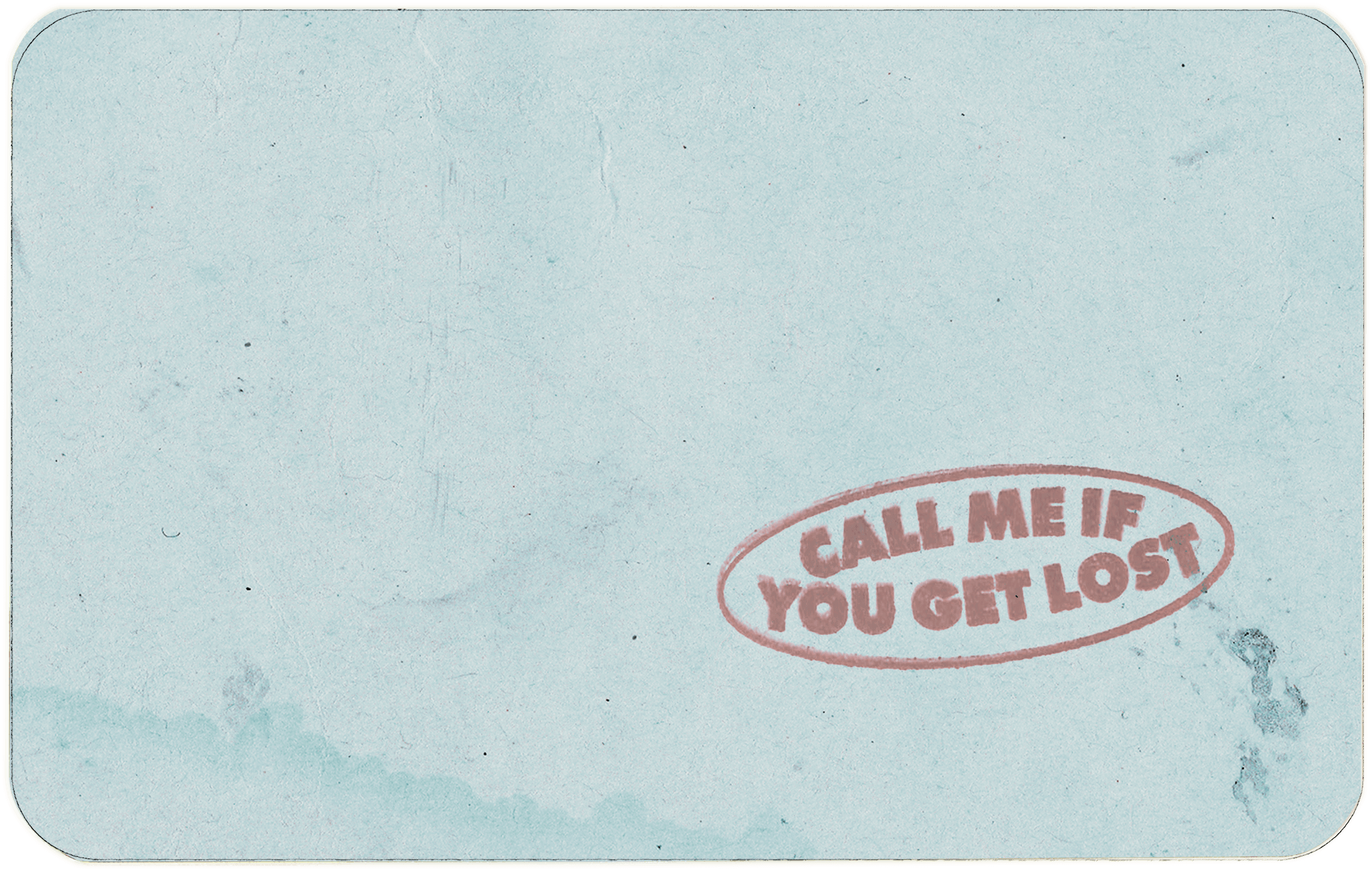
Paper texture matters
The slightly worn, printed look keeps the design from feeling clean or synthetic.
Small details do narrative work
The serial number, issue fields, and stamp turn a portrait into a persona.
Object
The ID card is the gateway to the whole era
The CMIYGL cover does not present Tyler as a floating portrait or a luxury brand ad. It documents him. That instantly changes the feel. A record with an ID card cover suggests movement, permissions, records, aliases, and crossings.
Fan edits usually work best when they respect the document logic. The more the card feels like a travel object first and a poster second, the closer it sits to the original mood.
Portrait
The photo slot works best when it stays simple
The portrait is centered, direct, and almost severe. It does not need a dramatic pose because the costume, texture, and document framing are doing the rest of the work.
That directness matters. A selfie with too much angle or too much expression fights the design. The original image reads like paperwork with style, not style pretending to be paperwork.
Motifs
The details that make the card feel real
Star border
The stars frame the document like a seal. They make the edge feel ceremonial instead of decorative.
Serial number
A number turns the card from portrait art into something catalogued and issued.
Issue fields
Name, date, and place fields add just enough bureaucracy to make the fantasy legible.
Stamp overlay
The stamp breaks the flatness of the page and makes the document feel handled, approved, and slightly worn.
Colorways
What the different card colors change
The alternate color versions do not need a giant theory behind them. They work because the base design is strong enough to survive the palette shift. Same document, different climate.
In practice, the colors change the temperature of the card more than its identity. Yellow feels archival, blue opens the design up, mint reads lighter, and pink adds a little more play.
Yellow
Best when you want the most classic, paper-heavy version of the card.
Blue
Feels airy and open, especially with portraits that already carry cool tones.
Mint
Softens the card without making it too sweet.
Pink
Pushes the design toward personality and play without changing the structure.
Carry-on
How to tell when a fan version works
The strongest fan-made cards keep the formality of the original. They do not overcrowd the page, they keep the text short, and they let the document frame do the storytelling.
If the card feels too polished, too loud, or too crowded, it usually means the image has stopped behaving like an ID and started behaving like a poster.
Quick Answers
A few things worth clearing up
Are the alternate colors still the same idea?
Yes. They change the mood, not the underlying document language.
What does texture do for the design?
Texture keeps the card grounded in paper, ink, and handling. Without it, the design loses a lot of its believable charm.
Does the portrait need to be serious?
Not strictly, but a calm, centered face usually works better than a highly expressive pose.
What ruins the look fastest?
Too much text, an overly dramatic crop, or effects that overpower the card's printed-document feel.
Keep Reading
More CMIYGL pages
Story, motifs, visuals, and practical card-making notes live here.
The route through the album
A clear read on the loose plot, the emotional turns, and where tracks like WusYaName, Sweet, and Wilshire fit.
Read the storyWhat the passport world means
Travel, luxury, escape, performance, and the point where getting lost stops sounding glamorous and starts costing something.
Read the meaningMake a card that lands
Portrait setup, text length, color choice, and a few moves that keep the card feeling sharp instead of overworked.
Use the guide